ui/ux case study
Accessible Grocery Shopping, Simplified for Older Adults.

Simplifying everyday grocery shopping through clarity, accessibility, and better decision-making.
This project explores how a grocery shopping experiences can be redesigned to reduce cognitive load and support users who may feel less confident navigating digital products.
Timeline
2025 · UX/UI Design Concept
Background
Older adults often face challenges with digital grocery platforms - not because functionality is missing, but because the experience is overwhelming.
Existing solutions tend to prioritize features over clarity, making it harder for users to complete simple tasks with confidence.
This project focuses on rethinking the experience by reducing complexity, guiding user decisions, and creating a more predictable and calm interaction flow.
The goal was not to add more functionality, but to make essential actions easier and more intuitive.
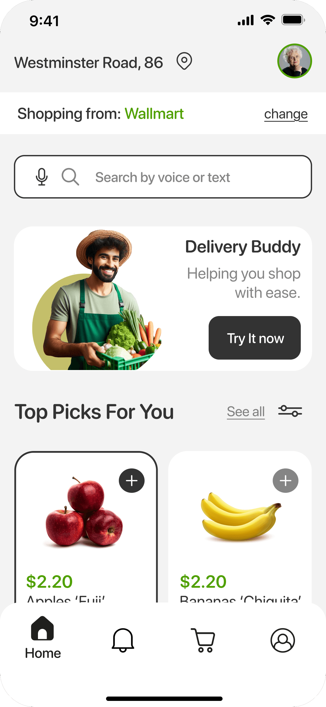
Solution Overview: Shop Helper is a mobile grocery concept designed to help seniors shop with confidence by reducing cognitive load and simplifying key decisions.
The solution focuses on clarity over complexity - guiding users through essential actions instead of overwhelming them with features.
Large touch targets
Designed with larger touch targets to reduce interaction errors and increase confidence for users with limited dexterity.
This decision prioritizes usability over density, making the interface easier to navigate without hesitation.
Clear visual hierarchy and simplified navigation
A simplified structure with clear visual hierarchy helps users quickly understand where they are and what to do next.
Instead of offering multiple navigation paths, the experience guides users step-by-step through essential actions, reducing confusion and decision fatigue.
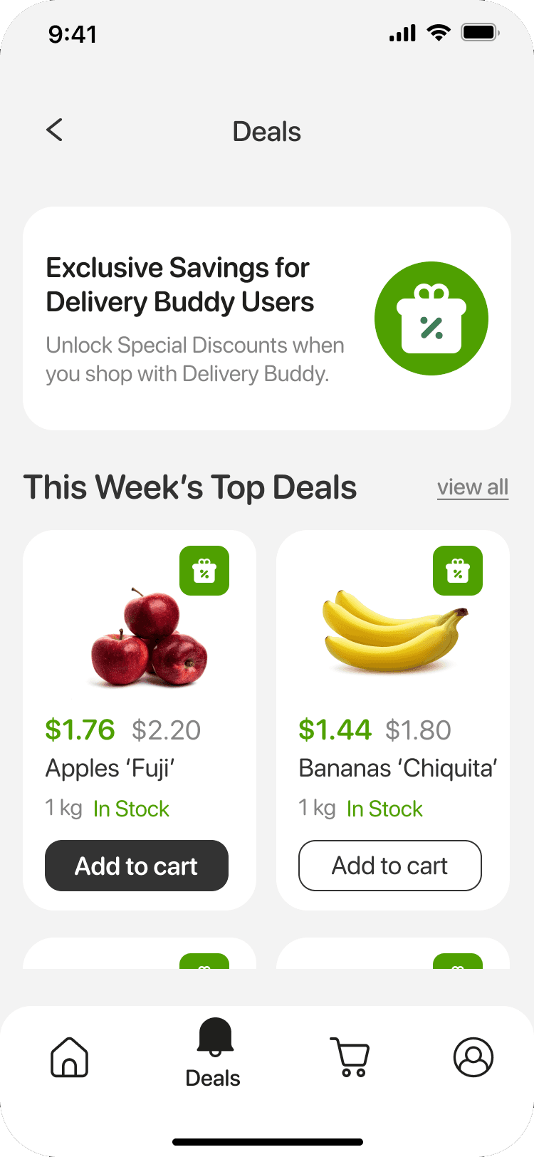
Voice-supported search
Voice and text search were introduced to reduce friction in product discovery, especially for users less comfortable with typing.
This approach prioritizes accessibility and speed, making it easier to complete tasks with minimal effort.
The process followed a structured product design approach - but more importantly, it focused on making decisions about what to simplify, remove, and prioritize.
Research & Insights
Identified common friction points in existing grocery apps:
Small tap targets and dense layouts
Multi-step checkout flows
Lack of reassurance and confirmation feedback
No physical or human support during navigating digital products.
Key insight:
Confidence - not just usability - is the main barrier for senior users navigating digital products.
Product Strategy
Based on these insights, I defined three core design principles:
Reduce cognitive load by limiting choices and simplifying flows.
Increase interaction clarity through clear hierarchy and guidance.
Integrate real-world support into the digital experience.
These principles guided all design decisions and helped prioritize clarity over feature complexity.
System Design
The system was designed to support clarity and consistency across the experience:
Scalable touch targets and high-contrast typography to improve accessibility.
Clear action labeling and structured navigation to guide users step-by-step.
Built-in confirmation and feedback patterns to reduce uncertainty.
Each element was intentionally simplified to reduce hesitation and support confident interaction.
Testing & Iteration
Core flows were tested and iterated to reduce friction and improve task clarity.
Early versions introduced too many steps and optional paths, which increased confusion.
Iterations focused on simplifying navigation, improving labeling, and strengthening confirmation states.
The final approach prioritizes fewer decisions and a more predictable user journey.
The final concept demonstrates how simplifying decisions - not just improving usability - can significantly reduce friction and increase user confidence in essential e-commerce flows.
Improved Task Clarity
Simplified navigation and larger touch targets reduced confusion during key flows such as search and checkout.
By limiting choices and guiding users step-by-step, the experience becomes easier to understand and complete - especially for first-time or less confident users.
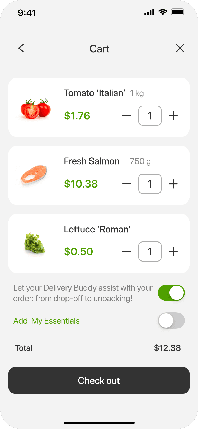
Validated Need for Assisted Delivery
The introduction of assisted delivery highlights the importance of combining digital and real-world support.
This feature addresses a gap often overlooked in existing solutions - helping users feel more comfortable and supported beyond the screen.
Increased User Confidence
Clear confirmation states and structured checkout flows reduce uncertainty and reinforce user confidence at critical moments.
Instead of questioning their actions, users are guided through a predictable and reassuring experience.